
Introduction: Why Graphic Design Principles Matter More in 2026
There have been many changes in graphic design over the last few years. AI tools can now make pictures in a matter of seconds. Automation handles tasks that need to be repeated. What people see on social media is decided by algorithms. But here’s the thing: design principles are still fundamental, even with all this new technology. It’s made them even more critical. What makes a good design stand out from a bad one when everyone can use the same AI generators and templates? The basics. The basic rules that have guided visual communication for decades remain essential, perhaps even more so than before. This guide goes over the 10 most important graphic design rules you should know in 2026. These rules will help your work stand out, whether you’re creating websites, social media content, or brand designs.
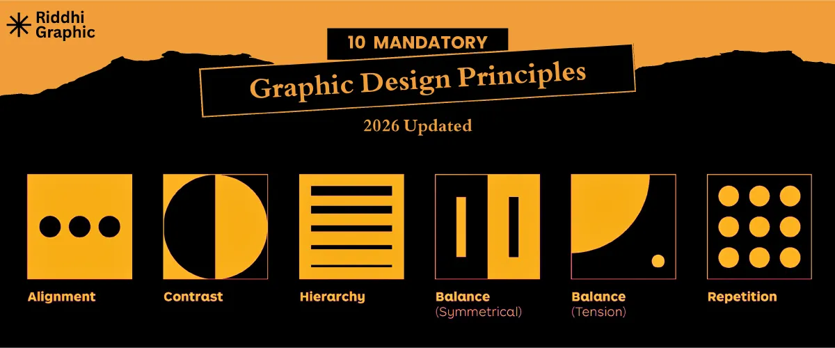
Top 10 Graphic Design Principles
1. Visual Hierarchy: Control Where Eyes Go First with
Visual hierarchy is the art of making it easy for the viewer’s eye to follow. What do people look at first when they see your design? Second? Third? You should be in charge of that flow, not leave it up to chance. Think about how you read a page on the web. Your eyes probably go first to the biggest headline, then to an image, and finally to the smaller text. That’s how visual hierarchy works. Here, size is important. Contrast does too. Before muted colors, bright colors get people’s attention. Bold text beats light text. People usually see things at the top of a layout before they see things at the bottom. The spacing is also very important. Items that are separated by extra space naturally draw attention. Position is important because in most Western contexts, we read from left to right and from top to bottom. When someone is scrolling through social media, you have about two seconds to get their attention. Your hierarchy needs to be strong and clear from the start. A clear hierarchy on websites helps users find what they need without getting annoyed. It ensures your main message comes across before anything else in branding materials.
2. Balance: Creating Stability Without Looking Static
Design balance is like balance in real life. People notice when something isn’t right. Even if they can’t explain why, their brains know when something is wrong. Symmetrical balance gives both sides of a design equal visual weight. It feels official, steady, and reliable. Banks and law firms like symmetrical layouts because they make things look more trustworthy. Asymmetrical balance uses different things that still feel equally heavy. It’s more modern and dynamic, but it’s harder to do. A good balance makes things easier to read. People can focus on the content rather than be visually distracted when a layout feels stable. Brands that don’t have a good balance look unprofessional or careless. People might not say “this design is unbalanced” out loud, but they’ll feel like something’s wrong and leave. Asymmetry is a common way for modern digital designers to add interest while maintaining balance. A big-picture image on the left could pair well with a few smaller text blocks on the right. The weights are different, but the composition still feels solid.
3. Contrast: Making Designs Pop in a Scroll-Heavy World
Take 30 seconds to scroll through Instagram or TikTok. Did you notice how much content you skip? Certain posts make you stop scrolling because of the contrast. Contrast makes things clear and sets them in order. It is easy to read when there is a strong contrast between the text and the background. Different sizes help essential parts stand out. Color contrast makes certain areas stand out. Accessibility is more important than ever in 2026. To help people with vision impairments read your content, contrast ratios must meet WCAG requirements. Accessibility standards say that normal text should have a contrast ratio of at least 4.5:1 and large text should have a contrast ratio of at least 3:1. But you can go too far. There is too much contrast everywhere, which makes things look messy. With everything screaming for attention, nothing gets the right amount. The secret is to use strategic contrast. Put it where you want people to look, and turn it down everywhere else.
4. Alignment – The Invisible Rule That Makes Designs Look Professional
People don’t notice when you get alignment right, but they do when you get it wrong. Designs look clean, organised, and professional when properly aligned. Grid systems give good alignment and structure. Margins keep content from getting too close to the edges. When pages or posts look the same, people trust them and recognise them more easily. Some common mistakes people make when aligning things are centring everything (which can look unprofessional), mixing alignment styles (like a left-aligned headline, centred body text, and a right-aligned button), or not using the grid at all. These mistakes may not seem like much, but they make the design look messy. Alignment has a direct effect on usability in UI and UX design. Users should be able to guess where to find things if buttons, forms, and navigation elements are all lined up the same way. In print, alignment helps the flow of reading. It makes text easy to read on small mobile screens in social graphics.
5. Repetition – Building Strong Brand Recognition
Patterns are something your brain loves. Repetition in design leverages this by making things familiar and strengthening the brand’s identity. All of your materials should use the same fonts. Stay with your colour scheme. Use the same shapes, icons, or graphic elements repeatedly. People will recognise your brand right away, even without seeing your logo. But there is a line between helpful repetition and bland sameness. You want the main parts (like typography, colours, and overall style) to stay the same, but the details (like layouts, images, and messaging) to change. It’s like a TV show: the opening credits and theme song are the same every time, but the story is different. Repetition is perfect for social media. You build presence in people’s feeds when they scroll past your posts again and again, and they all look the same. They start to recognise your posts before they even read who wrote them.
6. Proximity: Organizing Information Without Clutter
Proximity is easy: things that go together should be close together. There should be space between things that don’t go together. This principle helps you see how information is organised. When related things are close together, people automatically know they’re connected. Headlines that are close to the text. Prices next to pictures of the items. All of the contact information is in one place. Reasonable proximity makes it easier for the brain to work. It’s not hard for people to figure out what goes with what. The way things are set up works for them. Being too close together makes things confusing. A caption that is far away from its picture. A bullet list with uneven spaces. Form fields are all over the place. Designers still make mistakes about how close things are to each other all the time. All the parts should be spaced the same way, regardless of their relationships. Gaps that break up logical groups at random. These mistakes might not completely ruin a design, but they do make it harder to read and look less professional.
7. White Space (Negative Space) – Letting Designs Breathe
The area around and between things in a design is called white space or negative space. Many beginning designers see it as wasted space and try to fill every pixel. White space is a powerful tool that experienced designers know how to use. Adding the right amount of white space makes text much easier to read. There needs to be space between the letters. Images need to be separate from other things. Overcrowded designs make you feel overwhelmed and cheap. Spacious designs look and feel better, and they are easier to understand. Many modern minimalist design styles use white space. Apple’s advertising is an excellent example of this. Luxury brands use a lot of space to show that their products are high-end and one-of-a-kind. UI designers use it to reduce visual noise and help users stay on task. The area doesn’t have to be white. It’s any space that isn’t occupied. The point is to give things space to breathe and give people’s eyes places to rest.
8. Typography – More Than Just Choosing Fonts
Choosing a font is only the beginning of typography. It’s about how text gets its message across through both what it says and how it looks. Different types of letters have different emotional meanings. Serif fonts often give the impression of being old-fashioned or official. Sans-serifs look modern and clean. Depending on the style, script fonts can look fancy or casual. The fonts you choose should fit your message and your audience. It matters how you pair fonts. You don’t often use just one font. Combining fonts that work well together without clashing makes things look interesting and gives them a sense of order. A bold sans-serif headline and a lighter serif body copy are a classic combination. In 2026, variable fonts are very popular. These let designers smoothly change weights and styles, giving them more freedom without having to load multiple font files. Typography mistakes can quickly undermine your professionalism, such as poor kerning (the spacing between letters). The line heights are either too tight or too loose. There are too many fonts in this design. The text is too small to read easily. Fonts that look nice for long paragraphs. Each of these mistakes makes the work that was already good worse.
9. Colour Theory: Designing With Psychology in Mind
Colours aren’t just for looks. They express feelings, make connections, and change how people act. Red gets people’s attention and can mean excitement, urgency, or danger. Blue makes you feel safe and calm. Yellow gives you energy, but it can also hurt your eyes. Depending on the situation, green can mean growth, nature, or money. These connections are powerful in a person’s mind. Choosing colour palettes is both an art and a science. What feelings do you want to bring up? What colours do your competitors use so you can stand out? Which colour combinations are available for people who can’t see colours? As design becomes more global, cultural context becomes more important. In Western cultures, white symbolises purity, while in some Eastern cultures, it symbolises mourning. In China, red is a sign of good luck, but in a lot of the West, it means danger. Find out what colours your audience associates with their culture. In 2026, modern palettes will lean toward muted earth tones, high-contrast bold combinations, and schemes that are easy to use and look good in both light and dark modes.
10. Consistency – The Key to Trust, Usability & Brand Authority
All the other principles are linked by consistency. When your designs are visually consistent, you gain trust, make things easier to use, and boost your brand’s authority. It means that all platforms should use the same basic parts. Your Instagram posts should link to your website, which in turn links to your email newsletters. Not the same, but clearly related. Brand guidelines and design systems enable consistency across many aspects. They document your colours, fonts, spacing rules, image styles, and other settings. UI kits make sure that interface elements work as expected. But being consistent doesn’t mean being boring. You keep the basics the same while changing how you do things. Different layouts, but the same colours. Same font, other messages. The core identity stays the same, but the outer parts change.
Conclusion: Mastering Graphic Design Principles in 2026
It only takes a few weeks to learn any design software. AI tools can make pictures right away. But it takes time and practice to really understand these ideas, which is why they are so helpful. Tools come and go. For decades, Photoshop was the best. Then Figma changed the game. Now, AI generators are changing everything. Visual hierarchy worked in print ads in the 1950s, and it works in TikTok videos in 2026. Balance was important in Renaissance art and remains vital in modern web design. These basics will keep your skills up to date. You’ll be able to quickly adapt to the next big design tool or trend because you know how it works. When the interface changes, designers who only know which buttons to click have a hard time. Designers who understand why things work can apply that knowledge anywhere. Even though AI design is here, we still need human designers who know how to apply principles. People who can intelligently direct AI tools, critically evaluate outputs, and add strategic thinking to visual communication are in high demand. That means you need to know the basics very well.
Last Thoughts for Long-Term Success
If you learn these 10 rules, you’ll be able to do better work no matter what tools you use or what trends are popular. You don’t have to follow them without question. They are guidelines to help you make choices. It can affect you when you break a rule on purpose. But you have to know the rule well before you can break it well. Not following rules at random is just bad design. It’s an advanced technique to bend strategic principles. On purpose, practice using these rules. First, think about hierarchy when you start a new project. How will you lead the viewer? Then think about how to balance, contrast, and align. Instead of making automatic choices, make conscious ones. Design is a way to solve problems visually. These rules will help you solve problems. Keep learning, keep practising, and keep pushing yourself to learn more. That’s how to make a career that lasts longer than the next trend.